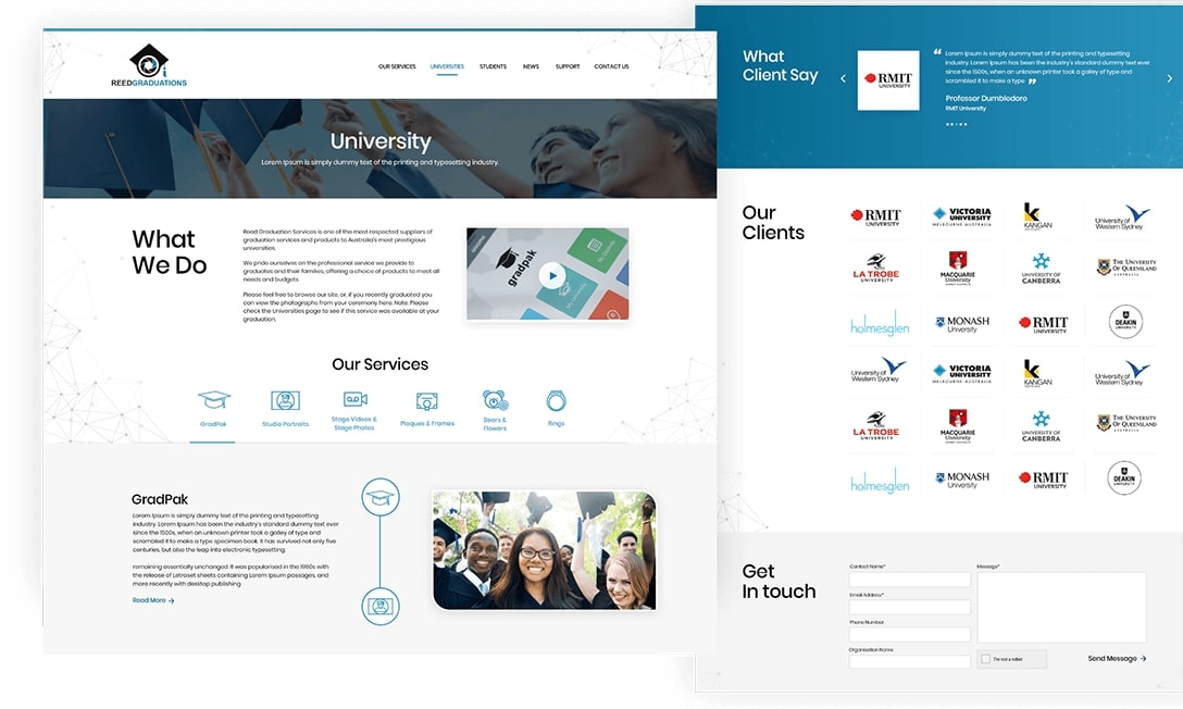
Data dashboards are one of the most technically complex UI design challenges — the goal is to present complex, multi-dimensional data in a way that allows users to understand patterns, identify problems and take action without spending 10 minutes decoding the interface. Many Indian software products and internal tools have dashboards that were built by developers with no design input — functional but cluttered, inconsistent and slow to navigate. At Chulbul Design, we specialise in designing dashboards and admin UIs for SaaS products, ERP systems, CRM platforms, analytics tools, operations management systems and internal business intelligence tools. Our designs are built in Figma with a component-based approach that maps directly to React or any modern frontend framework.
Information Architecture — Deciding What to Show and When
Before any dashboard UI design begins, we answer the most important question: what decision does each user role need to make, and what data do they need to make it? A sales manager needs pipeline health and rep performance. An operations head needs delivery status and bottlenecks. A finance director needs cash position and receivable aging. Each role has a different information priority — and a single dashboard trying to serve all of them serves none of them well. We conduct user research, define role-based views and create information architecture wireframes that prioritise the right data for each user type before any visual design begins. This information architecture phase prevents the most common dashboard design mistake: including everything instead of including what matters.
- Role-based information architecture — different views per user type
- Data hierarchy — primary KPIs, secondary metrics, detail drill-down
- Navigation structure for complex multi-module admin panels
- Wireframe approval before visual design starts
- User journey mapping for key admin workflows
Data Visualisation Design — Charts That Communicate, Not Just Display
Choosing the wrong chart type is one of the most common dashboard design mistakes. A pie chart with 8 segments communicates nothing. A line chart comparing monthly revenue without a baseline or benchmark provides no context for whether the trend is good or bad. We select chart types based on the question each visualisation needs to answer: bar charts for comparison, line charts for trends, area charts for volume over time, scatter plots for correlations, heatmaps for pattern density and KPI cards for single most-important numbers. We design all charts with appropriate colour coding (accessible to colour-blind users), clear axis labels, tooltips with contextual information and responsive behaviour so they display correctly on both wide monitors and laptop screens.
- Chart type selection based on the question, not aesthetics
- Colour-accessible design — works for colour-blind users
- Interactive tooltip and drill-down design
- KPI cards with trend indicators and context
- Responsive charts — correct on 1920px and 1280px screens

Figma Design System — Developer-Ready Component Library
Every dashboard UI we design is delivered as a Figma file with a structured component library — not flat screens. Components include all states: default, hover, active, disabled, loading and error. Form elements are designed with validation states. Tables have sorting, filtering and pagination states designed. Modals, drawers and tooltips are designed with open and close states. This completeness means your development team has answers to every UI question without coming back to design — reducing back-and-forth by 80% compared to receiving flat mockups. We also provide a redline specification document with exact spacing, font sizes, colour codes and component measurements for precise implementation.
- Figma component library — all states designed
- Auto-layout components — responsive in Figma
- Design tokens — colours, spacing, typography in variables
- Developer handoff — Figma inspect mode with exact specs
- Light and dark mode variants if required
80+
Dashboards Designed
Figma
Component-Based Delivery
All States
Designed — No Surprises
10+
Years Experience
Related Services
More ways we can help your business grow
Conversion Rate Optimisation
Conversion Rate Optimisation India | CRO Services – Chulbul Design
Branding & Identity
Brand Identity Design India | Complete Brand Identity System – Chulbul Design
Logo Design
Logo Design India | Professional Logo Design for Indian Businesses – Chulbul Design
Graphic Design
Graphic Design Services India | Brochures, Social Media & Print Design – Chulbul Design
Ready to Grow Your
Business With Us?
Free consultation — tell us about your project and we'll get back within 1 hour.